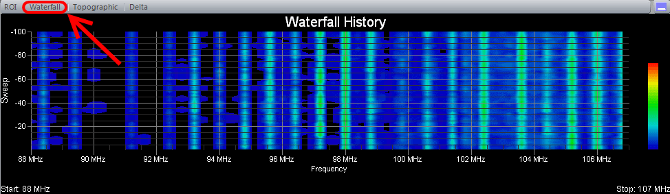
The 'Waterfall History view is also known as a "heatmap" graph. It is a 3-dimensional representation of the data, where the X-axis is the frequency scale, the Y-axis is a time scale, and the "Z-axis" is the color scale. Each horizontal line in the Waterfall chart displays the signal strength (as a color) as a function of frequency as measured over the time period of one scan. That is, with each scan (or sweep) a new row is added at the bottom of the Waterfall chart.The color legend to the right shows that stronger signals will appear red and weaker signals will appear blue.
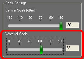
On the Control Panel there is a group of settings with the heading 'Scale Settings'. Within that group of settings there is a 'Waterfall Scale' slider control that applies only to the 'Waterfall History' view. This control can be used to rescale the signal strengths to better spread them across the range of colors that are used. This is useful when all the signal strengths are large and the Waterfall appears mostly red or when all the signal strengths are low and the Waterfall appears mostly blue. For the best visual effect, ideally you'd like the peaks (strong signals) to appear red and the valleys (weak signals) to appear blue. But sometimes even the valleys have large signal strength values or the peaks have low signal strength values. This control is useful in remapping the color legend to better make use of the colors and how they are spread across the peaks and valleys of the signal strength values.