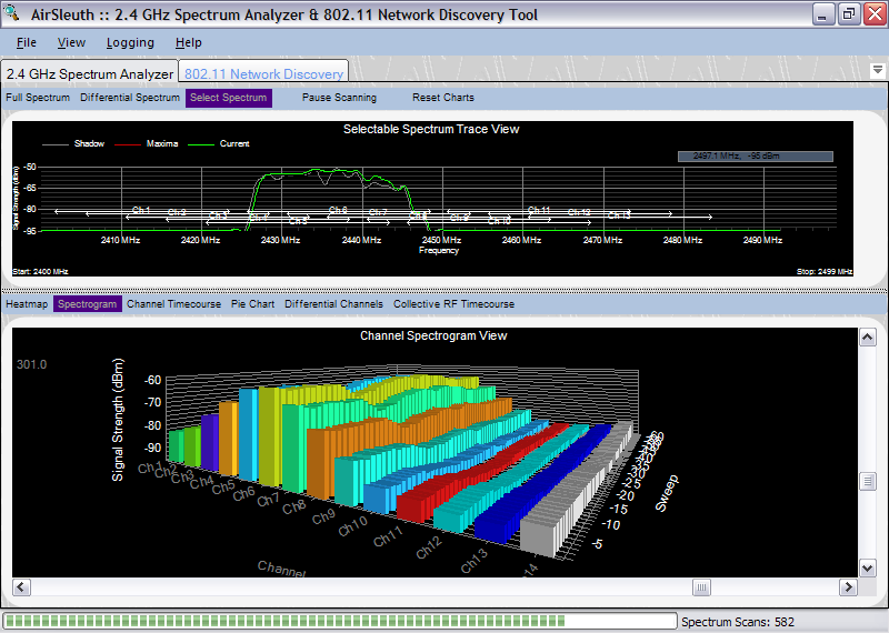
The Channel Spectrogram view is a 3D plot of Wi-Fi (802.11) channels as a function of time. Each channel is represented by its own set of bar graphs -- the z-axis is time and the y-axis is signal strength. As with the Channel Timecourse chart, this view makes it easy to visualize how RF interference affects different Wi-Fi channels over time.
This is one of the 'channel-centric' views that was described in a previous topic -- Overview of Plots and Charts. Here, instead of plotting signal strength versus frequency it plots signal strength versus channel. That is, the signal strengths of all frequencies used by a particular channel are summed, normalized and reported as one value. The algorithm computes the area under the frequency spectrum for each 802.11 channel which is then used as that channel's signal strength.
As with most of the charts, right-clicking the mouse button displays a context-sensitive, popup menu. For this chart the choices available from the popup menu include the following:
These were discussed in a previous topic -- Full Spectrum Trace View.
For this chart the default behavior is for the Y-axis of the graph to apply automatic scaling to accommodate the largest signal strength value. This can be changed using the 'Rescale Signal Strength' option from the popup menu.
Copyright © 2008, Nuts About Nets, LLC