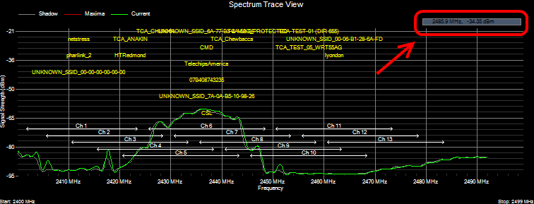
The analyzer continuously scans and samples the signal strength (dBm) of frequencies in the 2.4 GHz Industry, Scientific and Medical (ISM) unlicensed band. In the Full Spectrum view the signal strength data is plotted as a function of frequency.
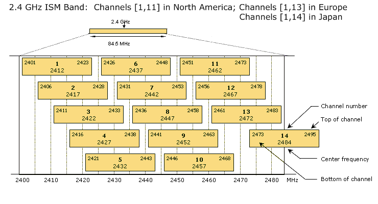
It is helpful to keep in mind that in the Wi-Fi world 802.11 devices operate on 'channels', rather than a particular frequency (as in AM or FM radio). An 802.11 channel is a range of frequencies, spanning 22 MHz. Furthermore, in 802.11 b/g the channels overlap -- as shown below. That is, adjacent channels are offset by 5 MHz and overlap by 17 MHz -- more than 75% of their channel width. As a result, when a peak of RF interference from a 2.4 GHz cordless phone appears in the middle of channel 1 it will not only knock-out channel 1 but also the adjacent channels.
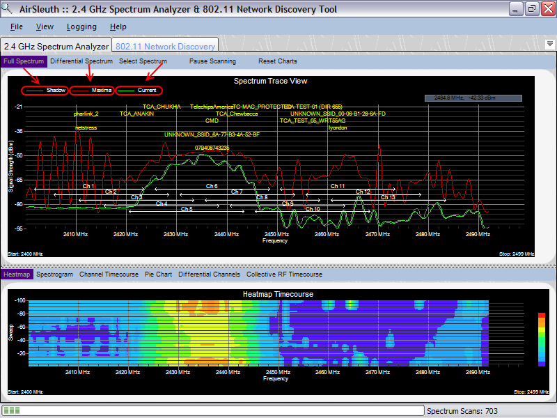
Current, Shadow and Maxima Traces
In this chart the RF signal strength data is plotted as a function of frequency. The horizontal white lines define the frequency range of each of the Wi-Fi channels. This makes it easy to visually correlate RF frequencies with WiFi channels.
Three traces are available -- Current (green), Maxima (red) and Shadow (gray). The Current trace displays the signal strength data from the most recent scan. The Maxima trace displays the maximum signal strength for each frequency since the scan session was begun -- similar to a 'Peak and Hold' function. The Shadow trace displays the signal strengths of the previous scan -- often times its interesting to note differences between the Current and Shadow scans. By default the Current and Shadow traces are displayed -- to show the Maxima trace, right-click the mouse button and a popup menu appears allowing you to show or hide the Maxima trace.

In the upper-right-hand corner of the view there is a small rectangle that displays the current [x,y] grid coordinates in MHz and dBm. As you move the mouse cursor around the chart then these coordinates are continuously updated.
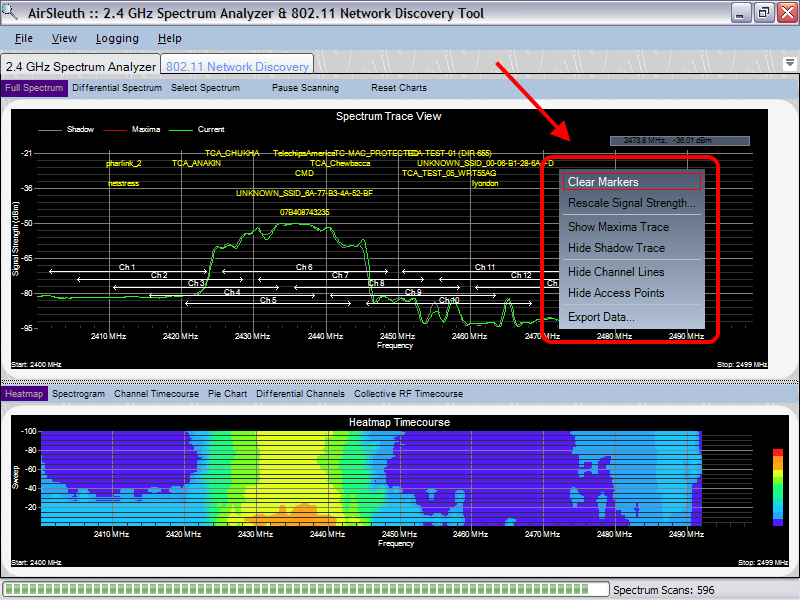
Popup Menu Options
With most charts when you right-click the mouse button then a context-sensitive, popup menu appears. For this chart the choices available from the popup menu include the following:
These choices are discussed below...
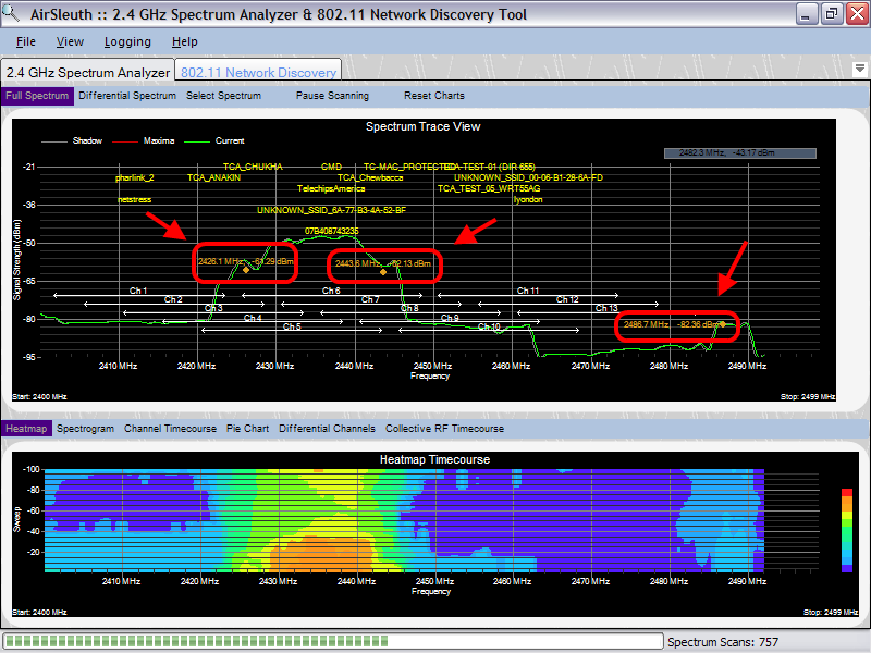
Marker Points and Hot Spots
When you left-click the mouse button then Marker points or 'Hot Spots' appear that display the corresponding frequency (in MHz) and signal strength (in dBm) for the location in the grid that you just clicked on. To clear the marker points, right-click the mouse button to access the popup menu and select 'Clear Markers'.
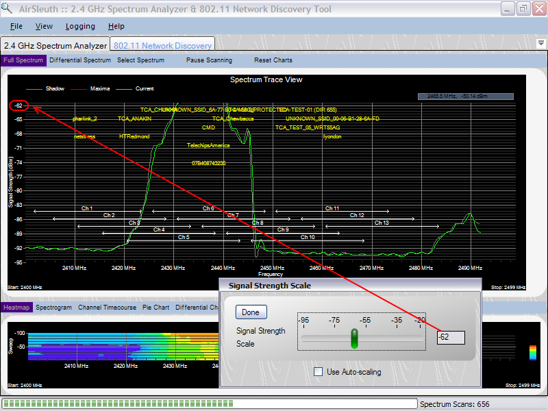
Rescaling the Signal Strength Y-Axis
The Signal Strength slider controls the height of the Y-axis in the Spectrum Trace views. By default it is set to -20 dBm (the maximum value). If your signal strength readings are relatively low then decreasing the scale of the y-axis has the effect of "zooming" the view. This has no affect on data acquisition -- only on how the data is displayed.
In the example below we've decreased the y-axis scale from -20 dBm to -62 dBm.
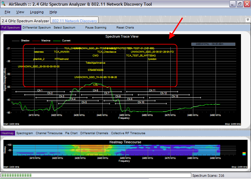
Access Points are Superimposed on the Spectrum View
When your PC is enabled for 802.11 network discovery, then the access points that it detects are superimposed on the Spectrum View. For example from the image below we see that the netstress, pharlink_2 and UNKNOWN_SSID_00-00-00-00-00-00 wireless networks are using channel 1. Likewise, the TCA_ANAKIN and HTRedmond wireless networks are operating on channel 3. This same information is available when you switch to the 802.11 Network Discovery views, but often you get a better picture of your site when you can actually visualize how access points are distributed across the 2.4 GHz band.
You can show or hide the access point labels by right-clicking the mouse button to access the popup menu and then selecting the appropriate option.
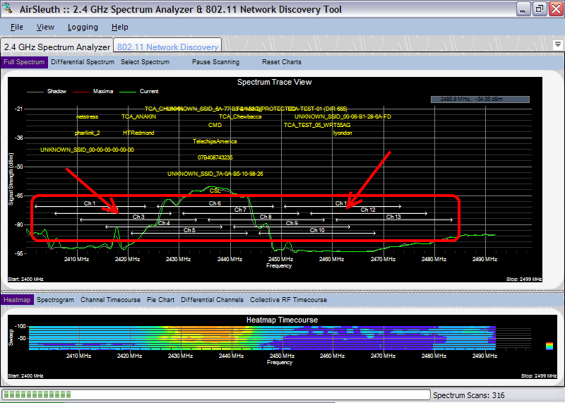
Wi-Fi Channel Lines are Superimposed on the Spectrum View
Superimposed on the spectrum view are the frequency ranges used by the Wi-Fi channels. Channels 1-11 are used in North America and 12,13 are used in Europe.
You can show or hide the access point labels by right-clicking the mouse button to access the popup menu and then selecting the appropriate option.
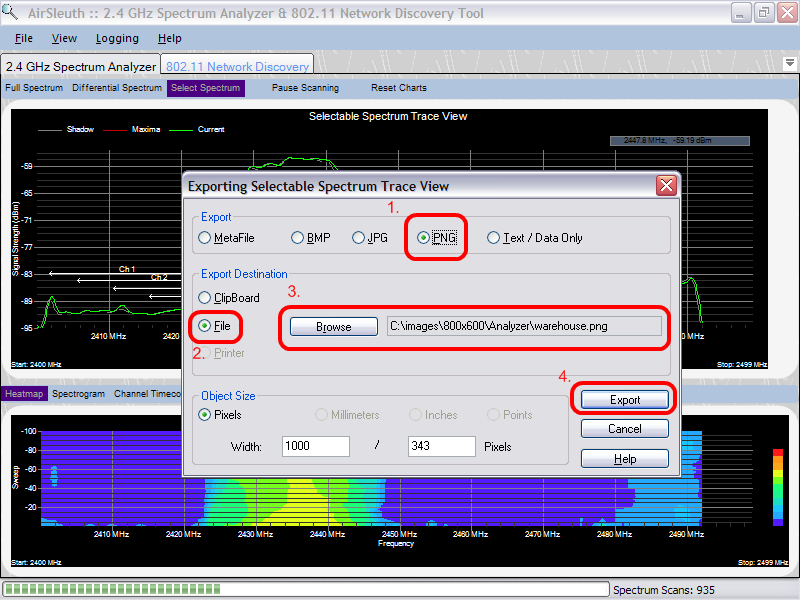
Export Data
When you select 'Export Data' from the popup menu then a dialog box appears which will allow you to (a) save the chart to the Windows ClipBoard for subsequent 'pasting' into another application, or (b) save it to a file, or (c) send it to a printer. Typically, you'll want to save the chart to a BMP, JPG or PNG file -- in which case you first select the format of the saved image (i.e. BMP, JPG or PNG) from the 'Export' group, and then select File from the 'Export Destination' group, followed by browsing to the location where you'd like to save the file. Finally, press the 'Export' button to actually save the file.
Show or Hide Maxima Trace & Show or Hide Shadow Trace
By right-clicking the mouse button to access the popup menu you can toggle whether the Shadow and/or Maxima traces are shown. If the Maxima or Shadow trace is currently hidden and you wish to display it again, then from the popup menu select 'Show Maxima Trace' or 'Show Shadow Trace' and it will once again be included in the view.
Copyright © 2008, Nuts About Nets, LLC