Overview of Diagnostic Charts
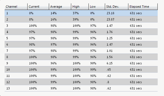
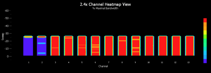
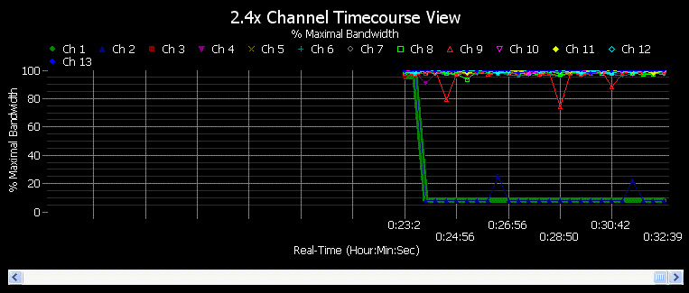
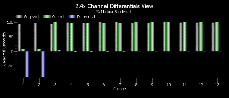
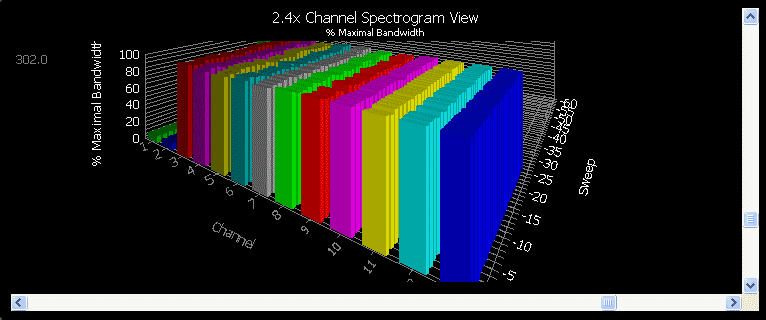
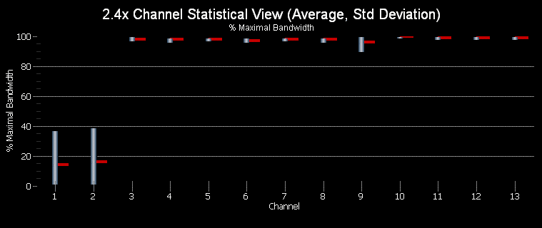
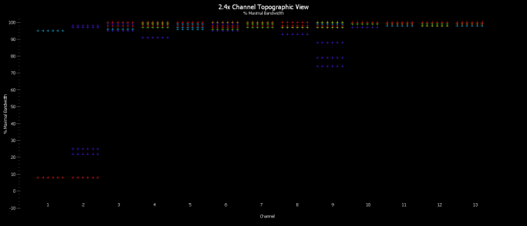
Below are sample screenshots from Profiler24x. Profiler24x employs IMMI technology to perform channel analysis and measure the throughput performance of each 802.11 channel. Comparing the result with a reference, a performance metric is calculated for each channel and presented in terms of '% Maximal Bandwidth'. A value of 100% suggests the throughput performance of the channel is its expected maximum -- anything less than 100% suggests that throughput performance has been degraded to some degree, most likely due to RF interference from other wireless devices (either 802.11 or non-802.11).
1. Statistical Grid
|
2. Channel Heatmap / Waterfall Timecourse Chart
|
3. Channel Timecourses Chart
|
4. Differential Channel Chart
|
5. Channel Spectrogram Chart
|
6. Channel Statistics Chart (Average, Std. Deviation)
|
7. Topographic Channel Chart
|
Copyright © 2010, Nuts About Nets, LLC