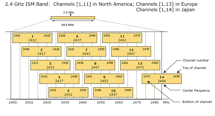
Profiler24x continuously scans and samples the throughput rate of 802.11 b/g channels in the 2.4 GHz Industry, Scientific and Medical (ISM) unlicensed band. It is helpful to keep in mind that in the Wi-Fi world 802.11 devices operate on 'channels', rather than a particular frequency. An 802.11 channel is a range of frequencies. The diagram below shows that 802.11 b/g channels span 22 MHz. Furthermore there is tremendous overlap between adjacent channels. Adjacent channels are offset by 5 MHz and overlap by 17 MHz -- more than 75% of their channel width. As a result, when a peak of RF interference from a 2.4 GHz cordless phone appears in the middle of channel 1 it will not only interfere with channel 1 but also the adjacent channels.
Example -- Interpreting the Diagnostic Charts
The diagnostic charts are easy to use and interpret, and to illustrate this we've chosen as an example to perform an analysis in the presence of an active 2.4 GHz cordless phone. For all charts the results are presented for each channel in terms of % Maximal Bandwidth. % Maximal Bandwidth is a performance metric. The WifiBuilder AP has an optimal throughput capability (measured in bytes / sec) that was calibrated and is subsequently used by the application as a reference. The % Maximal Bandwidth reported by Profiler24x can be used as a predictor of how well each channel can be expected to perform (relative to its optimal throughput capability) in the current RF environment.
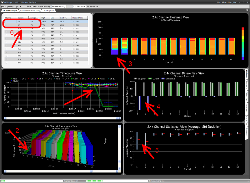
Referring to the figure above...
Channel Timecourse Chart (Arrow #1): The Channel Timecourse view is useful for monitoring channels as a function of time. Each channel is represented by a different line -- the x-axis is time and the y-axis is % Maximal Bandwidth. In this way one can clearly follow how RF interference affects different channels over time. You can see that for channels 1 and 2 their % Maximal Bandwidth values began to drop the moment the phone is turned on.
Channel Spectrogram Chart (Arrow #2): Shows a similar result as the Channel Timecourse chart, but in 3-dimensions. The Channel Spectrogram view is a 3D plot of 802.11 channels as a function of time. Each channel is represented by its own set of bar graphs -- the Z-axis is time and the Y-axis is % Maximal Bandwidth. As with the Channel Timecourse chart, this view makes it easy to visualize how RF interference affects different 802.11 channels over time.
Channel Heatmap Chart (Arrow #3): Also known as a "waterfall" graph. It is a 3-dimensional representation of the data, where channels are marked along the X-axis, the Y-axis is a time scale and indicates the last 60 scans or sweeps, and the "Z-axis" is the color scale. Each horizontal line in the Heatmap chart displays the % Maximal Bandwidth (as a color) for each channel measured over the time period of one scan. That is, with each scan or sweep a new row is added at the bottom of the Heatmap chart and it continues to scroll upward. The color legend to the right shows that larger values for % Maximal Bandwidth will appear red and smaller values will appear blue. In this example, we see that for channels 1 and 2 that shortly after the cordless phone was turned on then the color changed from red, to orange, to light blue and then dark blue, again indicating a drop in % Maximal Bandwidth.
Channel Differentials Chart (Arrow #4): The gray bars are a snapshot of the % Maximal Bandwidth values when the program was first launched, the green bars are the current values, and the blue bars represent the difference. For channels 1 and 2 you can see a big difference between the snapshot (taken when the program was launched) and the current values (since the cordless phone was turned on). This display can be used to view small (or large) changes in the RF landscape over time. Here's how it works... When the application is first launched then a scan is performed and stored as a 'snapshot' (the gray bars) -- these are static and do not change. A real-time measurement for each 802.11 channel is then displayed using green bars, and the differences between the 'snapshot' and current displayed using blue bars. Plotting the data in this way makes it easy to detect changes that occurred since the last 'snapshot'.
Channel Statistical Chart (Arrow #5): Shows an averaged value of % Maximal Bandwidth for each channel since the program was first launched (the horizontal red bar), along with its associated standard deviation. Again, you can see that for channels 1 and 2 their % Maximal Bandwidth values have dropped. Also, the large spread in standard deviation indicates the throughput values for these two channels have not been stable and have been subject to a lot of variation.
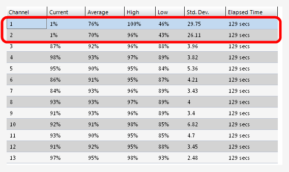
Statistics Grid (Arrow #6): For each channel, reports several properties of the % Maximal Bandwidth -- the current value, an averaged value, a high and low value (obtained from the average and standard deviation), the standard deviation, and the elapsed time since this session began. For channels 1 and 2 their current values are very small (e.g. around 1%) indicating interference from the cordless phone is nearly complete and throughput for these two channels can be expected to be almost zero. The corresponding average % Maximal Bandwidth for these two channels takes into account measurements prior to when the phone was activated -- hence the average is still around 70%, though lower than the other channels. The High and Low values are roughly the Average +/- the standard deviation. A larger and more readable version of the grid is shown below...
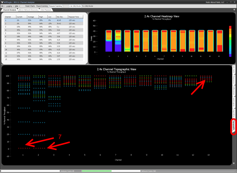
Channel Topographic Chart (Arrow #7): Similar to a 3-D histogram, the topographic chart (above) shows how frequently certain % Maximal Bandwidth values occur for each channel. The more frequently a particular value is measured for a channel, then the color gradually changes from blue, to green, to yellow and ultimately red. Red values are ones that occur frequently, whereas blue values occur least frequently. In this case, we see for channels 1 and 2 an preponderance of frequently occurring, low values -- again, consistent with the other charts. Furthermore, we see that for channel 13 there is a preponderance of frequently occurring high values of % Maximal Throughput. This, along with the data as presented by the other charts, indicates the RF transmissions from the 2.4 GHz cordless phone does not impact channel 13.
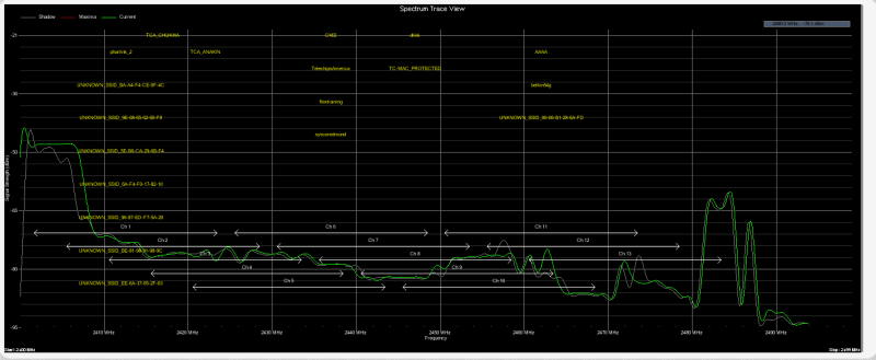
And, finally -- below is an RF spectrum trace of the same cordless phone taken using the AirSleuth-Pro spectrum analyzer. Though the data is very useful and certainly compliments Profiler24x, when you are working in 802.11's world of channels then it becomes more difficult to visualize how the RF data might impact 802.11 channels. And even if you could, because the 802.11 standard is composed of numerous protocols that dictate how an 802.11 device behaves, there is no way to be certain how, or even if, the RF peaks you see in a spectrum trace will affect an 802.11 device.
Copyright © 2010, Nuts About Nets, LLC