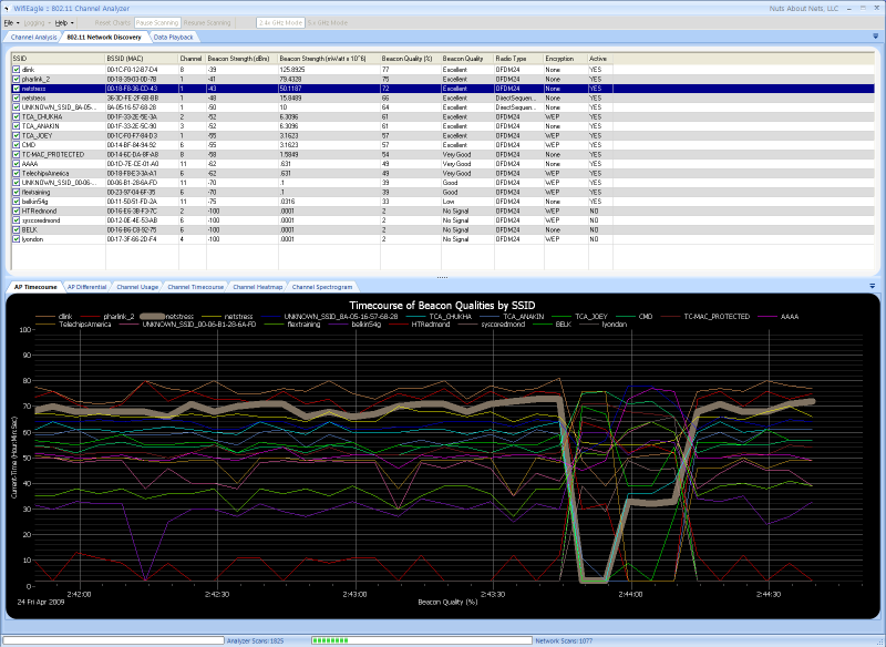
This chart displays the beacon strength of each access point as a function of time. The Y-axis reports the signal strength as a signal quality (0 - 100%) -- where a maximum signal is assumed to be -20 dBm and the dissociation signal is -85 dBm (http://www.ces.clemson.edu/linux/dbm-rssi.shtml). We find this more intuitive than reporting a RSSI in dBm or mWatt. If you would also like to know the signal strength in dBm then this is reported in the grid above the chart.
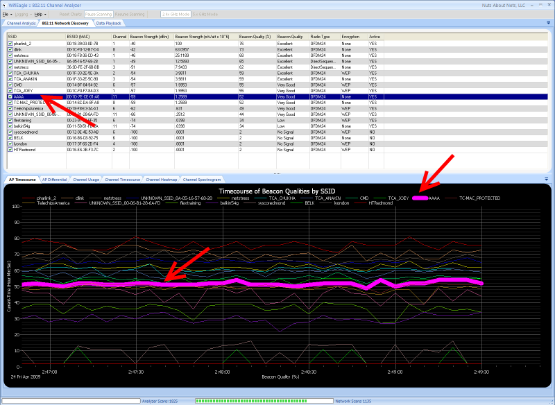
This chart can become difficult to read when there are many access points -- because there are so many lines. Even though each timecourse is color-coded to correspond to a particular AP, it becomes hard to pick out a single AP and follow its timecourse. The application provides a couple of ways to aid you in viewing the behavior of a specific AP in a crowded chart. In the grid above the chart, by simply selecting (i.e. highlighting) the row that corresponds to a particular AP then the corresponding timecourse is highlighted in the chart. In the example below we selected the BSSID corresponding to 'AAAA' and now we can clearly monitor that particular timecourse.
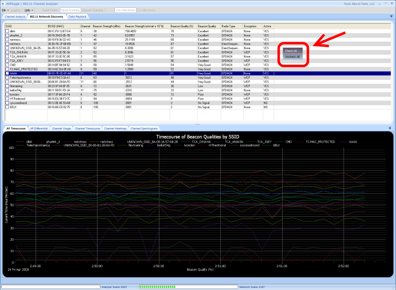
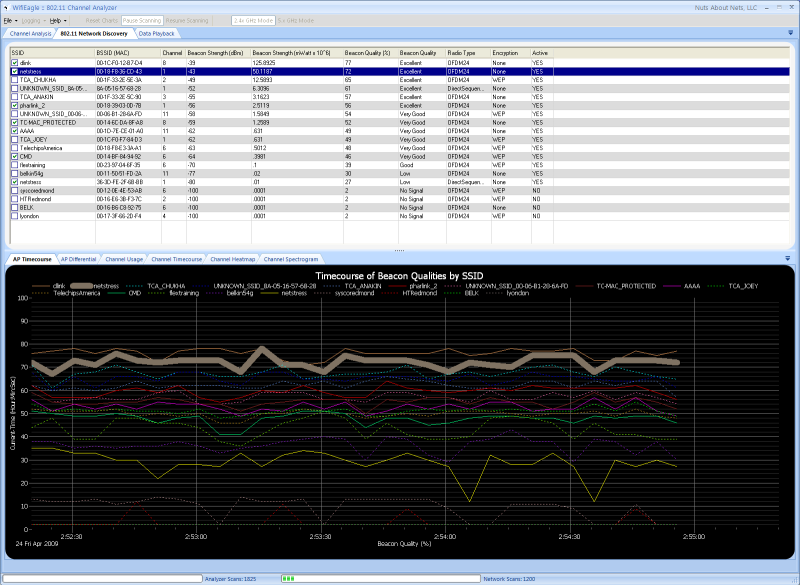
When you right-click the mouse button in the area of the grid then a popup menu appears with two choices: 'Check All' and 'Uncheck All'. By choosing 'Uncheck All' then all the timecourse lines are redrawn as dotted lines -- as shown below. The lines are drawn as thin, solid lines when the checkbox under the SSID column (in the grid) is checked.
Using some combination of 'Checking' and 'Selecting' you can tailor the view to focus on the access points you are most interested in monitoring.
Copyright © 2009, Nuts About Nets, LLC