NetSurveyor-Pro continuously measures the throughput performance of each 802.11 connection (i.e. adapter / access point pair). ICMP (Internet Control Message Protocol) messages, also known as "ping" messages, are used to exchange data between an adapter and access point (or another IP address on the wireless network). The application measures the rate of data transfer and reports the throughput in Mbps (megabits per second). This metric is sensitive to a variety of factors that typically affect 802.11 networks (e.g. RF and multiplath interference, location of access point, antenna orientation, etc.) and, hence, reflects the current performance level of the wireless network. In addition, the application tracks the number of "dropped" messages and reports these as a temporary break in the connection. Dropped messages reflect the reliability of the network.
The theoretical, maximum throughput of 802.11 a, b, g networks are 54 Mbps, 11 Mbps and 54 Mbps, respectively. However, you will never achieve these rates under real conditions. Among other factors, RF interference and the overhead of an operating system and network software stacks take their toll on performance. Taking a variety of factors into account, others have determined that the best we can hope for under real-world operating conditions is roughly 44% of the theoretical maximum (see http://repository.cs.aueb.gr/getdoc.php?papercode=CPWR-18-2006 and http://www.atheros.com/pt/whitepapers/Methodology_Testing_WLAN_Chariot.pdf). As an example, for a WiFi network using 802.11 g the theoretical maximum throughput is 54 Mbps (megabits per second). Forty-four percent (44%) of 54 Mbps is 23.8 Mbps -- so, 23.8 Mbps is the real-world maximum and probably the best we could ever achieve (for an 802.11 g network). For connection and adapter analysis the performance data is displayed using a variety of different charts. Two of these charts, the Adapter Statistics grid in the upper left-hand corner and the Adapter Heatmap / Waterfall view in the upper right-hand corner display their results as a percentage relative to the real-world maximum. The decision to report these results relative to a real-world maximum, as opposed to a theoretical maximum, was by design. Since most users would not be familiar with the discrepancy that exists between the theoretical and real-world maxima, we felt percentages would have greater meaning if they were reported relative to the real-world maximum.
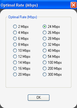
We've chosen 23.8 Mbps as the default value for the real-world maximum. However, an option exists for this to be adjusted by the user. On the main menu select Options / Adjust Optimal Rate... and a dialog box will appear:
Changing the real-world maximum will affect the relative percentages reported by the Statistics grid and also how the color scale is applied in the Heatmap view. The percentages reported by the statistics grid are relative to the real-world maximum, and the color scale in the Heatmap view divides the real-world maximum into 10 colors -- with red at the high-end representing 91-100% and black at the low-end representing 0-10%.
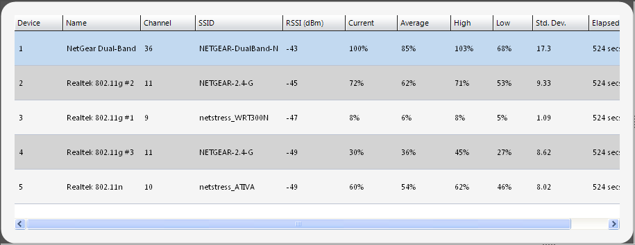
1. Adapter Statistics Grid
Most of the columns in this grid are self-explanatory -- though the 'Current', 'Average', 'High' and 'Low' columns require additional explanation. The percentages reported for those columns are relative to the real-world maximum which, by default, is set to 23.8 Mbps. So, a result of 50% means 50% of 23.8 Mbps, or 11.9 Mbps. NetSurveyor-Pro repeatedly measures the performance of each adapter connection and reports that as a percentage relative to the real-world maximum. 'Current' refers to the most recent measurement; 'Average' is the average of all measurements for that adapter since the application was launched; 'High' is the largest value for that adapter since the application was launched; and 'Low' is the lowest value since the application was launched. 'Std. Dev.' is the standard deviation of the performance measurements for that adapter since the application was launched and reflects the degree to which measurements vary from the average.
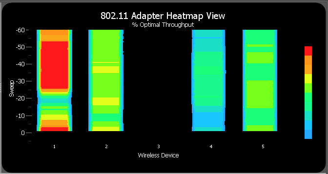
2. Adapter Heatmap / Waterfall Chart
This chart is a 3-dimensional representation of the data, where each adapter is listed along the X-axis, the Y-axis is a time scale and indicates the last 60 scans or sweeps, and the "Z-axis" is the color scale. Each horizontal line in the Heatmap chart displays the % real-world maximum (as a color) for each adapter measured over the time period of one scan. That is, with each scan or sweep a new row is added at the bottom of the Heatmap chart and it continues to scroll upward. The color legend to the right shows that larger values for % real-world maximum will appear red and smaller values will appear blue or black. Ten colors are used to represent the ranges 0-10%, 11-20%, 21-30%, 31-40%, and so on.
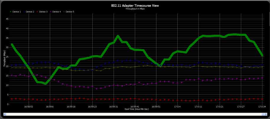
3 Adapter Timecourses Chart
This chart is useful for monitoring adapters as a function of time. Each adapter is represented by a different line -- the x-axis is time and the y-axis is Throughput (in Mbps). As an aid to viewing the behavior of a specific adapter simply select (i.e. highlight) the row corresponding to that adapter in the grid above and then its timecourse will be highlighted. In the example below we selected the adapter #1 and now we can clearly monitor its particular timecourse.
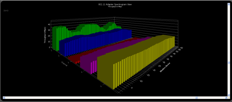
4. Adapter Spectrogram Chart
Shows a similar result as the Adapter Timecourses chart, but in 3-dimensions. The Adapter Spectrogram view is a 3D plot of the 802.11 adapters as a function of time. Each adapter is represented by its own set of bar graphs -- the Z-axis is time and the Y-axis is Throughput (in Mbps).
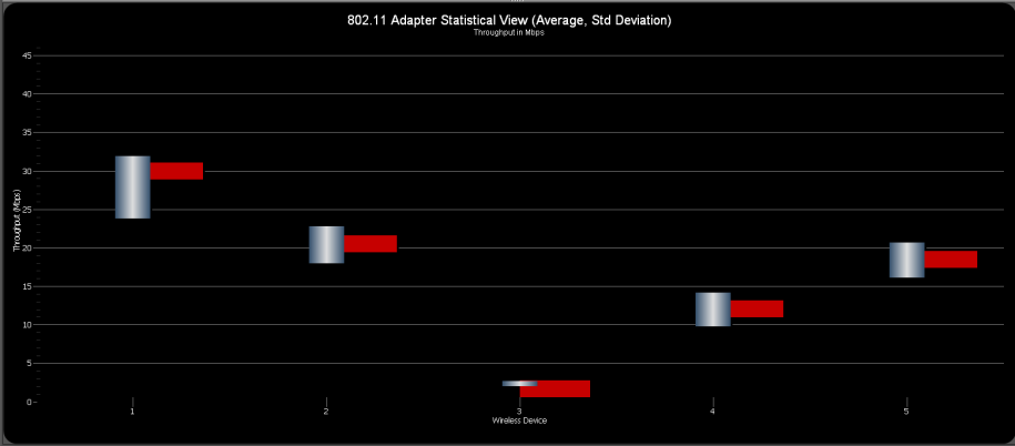
5. Adapter Statistics Chart (Average, Std. Deviation)
Shows an averaged Throughput value (in Mbps) for each adapter since the application was first launched (the horizontal red bar), along with its associated standard deviation. The standard deviation reflects the degree to which measurements deviate from the average. A smaller standard deviation is a good sign since it indicates that performance measurements have been relatively consistent and stable. A larger standard deviation indicates variation in the measurements and may be a reflection of the throughput reliability of that particular adapter.
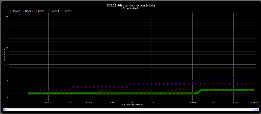
6. Adapter Connection Breaks
This is an interesting chart -- it tracks the number of failed ICMP or "ping" messages exchanged between an adapter and the access point it is associated with. These connection "breaks" or "drops" could be due to a variety of causes -- e.g. RF or multipath interference, weak and/or unreliable signals, collision with other 802.11 devices in the area, an overburdened adapter or access point, a malfunctioning adapter or access point. Also, if the adapter is not associated with an access point or dissociates while the application is running then the number of connection breaks will increment by one with each scan or sweep. In contrast with a performance metric, connection "breaks" or "drops" can be viewed as a reliability metric.
Copyright © 2009, Nuts About Nets, LLC